
Attended ‘Big Data Visualization’ meetup
Location: iStrategyLabs, Washington, DC
Organization: Data Visualization DC
Event: Big Data Week DC 2013
Presenter: Professor Ben Shneiderman, PhD, Dept of Computer Science, Founding Director of the Human-Computer Interaction Laboratory, member of the Institute for Advanced Computer Studies at the Univ of Maryland, College Park
Presentation: ”Information Visualization for Knowledge Discovery: Turning Messy BigData into Actionable SmallData” (SlideShare)
Synopsis
On Monday, April 22, 2013, I attended “Big Data Visualization,” a meetup event presented by Data Visualization DC. Part of a week-long series of events for Big Data Week DC 2013, its aim was to give a broad overview of some of the concepts of Data Visualization, as they relate to customization, usability, display, and presentation. The guest speaker was Professor Shneiderman from UMD. The question is: How can we present massive datasets of information in a clear, meaningful, and unobstructed fashion to users, so that they can easily and intuitively look at its graphical representation and instantly see relevant, desired, and conclusive relationships, as well as important anomalies (as it is oftentimes these anomalies we are most interested in)? Also, how does this change according to various constraints, such as multiple devices (mobile phone, tablet, laptop) with varying screen sizes and human-computer interaction constraints, as well as relating to the question we are trying to answer about the data presented?
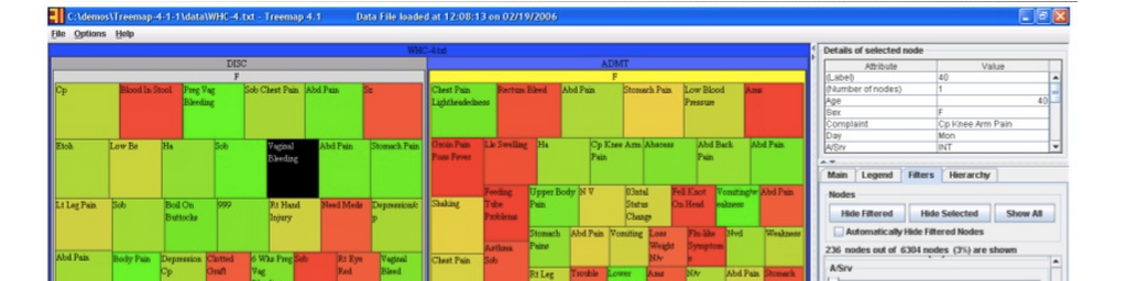
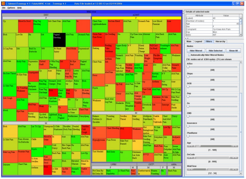
One example he spoke about was a hospital who wished to identify cases of possible procedural shortfalls or misconduct in their ER by staff, as patients are supposed to be admitted and handled in a certain way (depending on what their condition is) in a set amount of time. If this does not happen, this could contribute to negative outcomes, such as a worsening condition or even death. Below is an image that shows the intake of over 6300 patients in January, 2006, into this hospital’s ER facility. As can be seen almost immediately, wait time (size of each square) and age (color of each square) can be approximated almost instantly, giving one a very useful, generalized understanding of a large set of information. This type of display is called a “Treemap,” where the size of each nested square and its color can change according to weight. This display could also be “zoomed out” to encompass any patient dataset over any amount of time.
He gave a very informative, personable, and engaging talk; far too many concepts to cover in this space. I would encourage you to check out the link to his full slide presentation at the top!


Leave a comment